
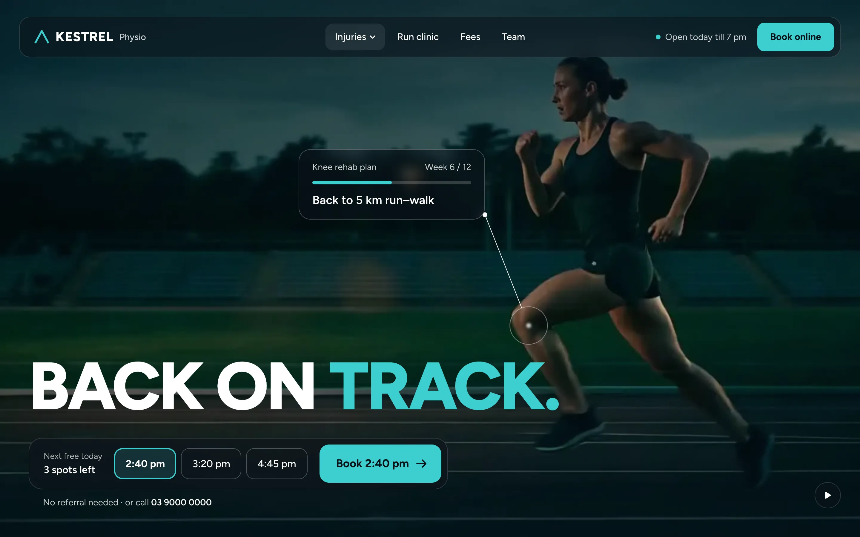
Kestrel Physio
Back on Track
FREE Health
Live now
Beauty1 heroConstruction3 heroesE-commerce1 heroFood & drink13 heroesHealth1 heroRetail1 heroTravel1 heroComing
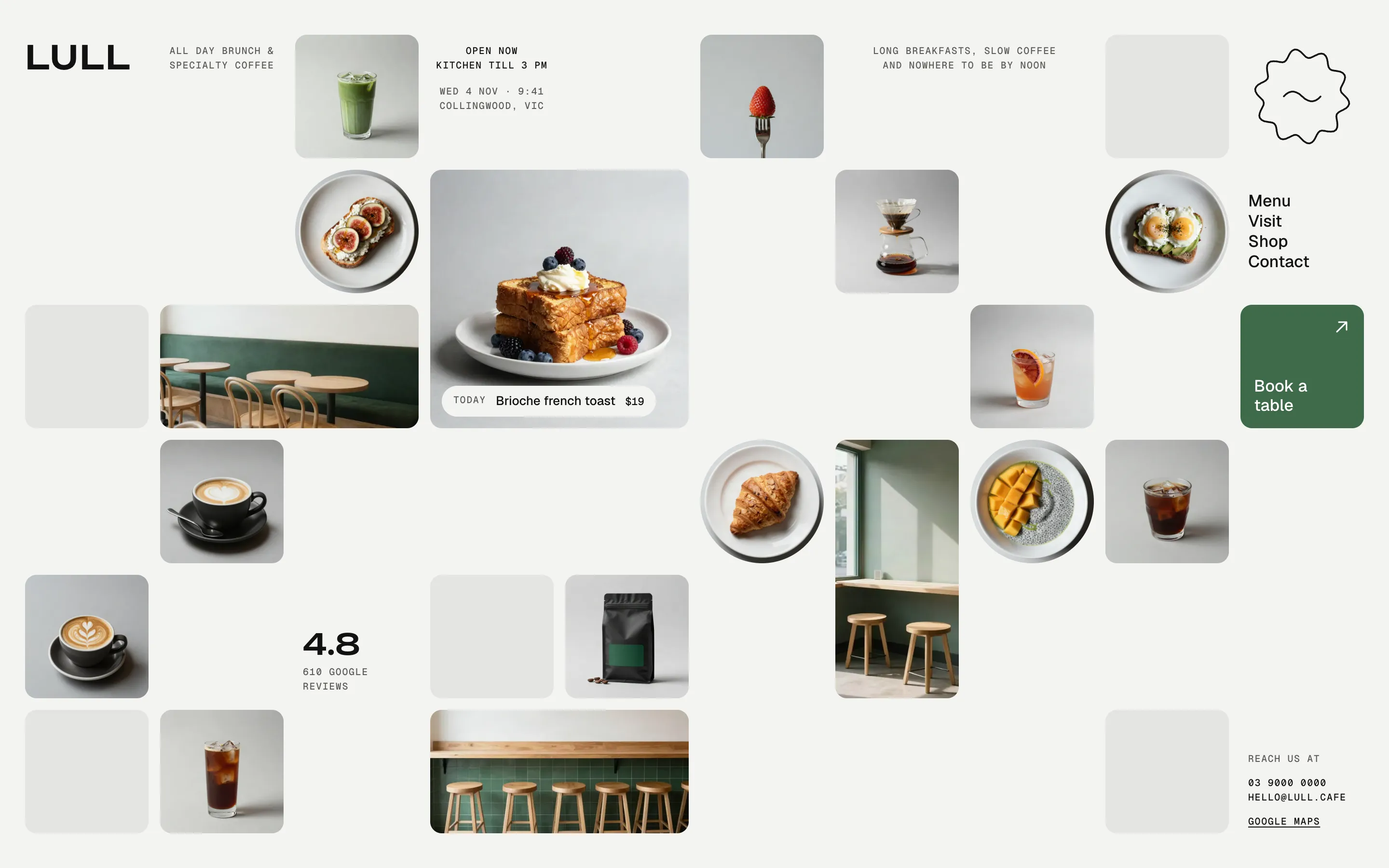
Design brief
People choosing a brunch spot want to see the food and the room, know it's open now and book a table. Let the photos be the page, say open or closed in plain words, and keep Book a table one square away.
Photos are the content
a grid of studio shots on one grey background reads like a gallery wall and shows the menu and the room at once.
The date line of a magazine cover becomes a live status
Open now · kitchen till 3 PM, from Melbourne time.
One matcha square under the menu is the only colour on the page, so Book a table is the first thing that stands out; on phones a book/call bar stays at the bottom.
Venues without good photos, or with a long menu to read
Try instead: Menu as Hero or Table Card
Works as HTML, Webflow, Framer, WordPress.
Book a table clicks and calls per visit
Back on Track
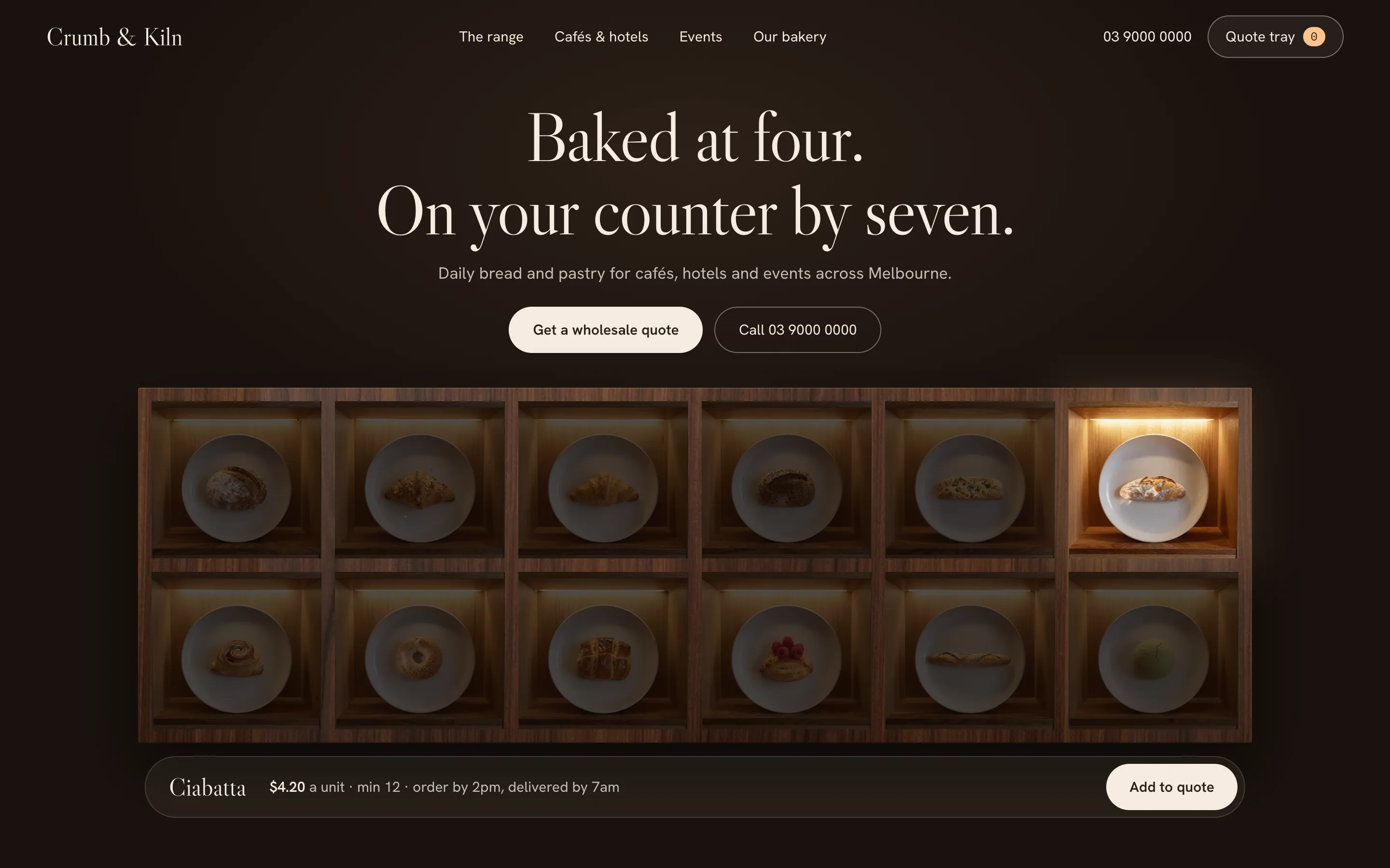
Bake Cabinet
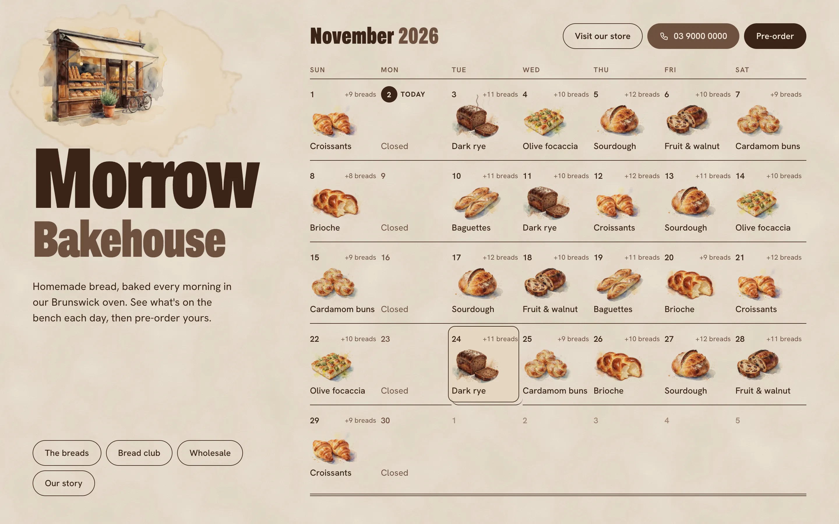
Bake Calendar
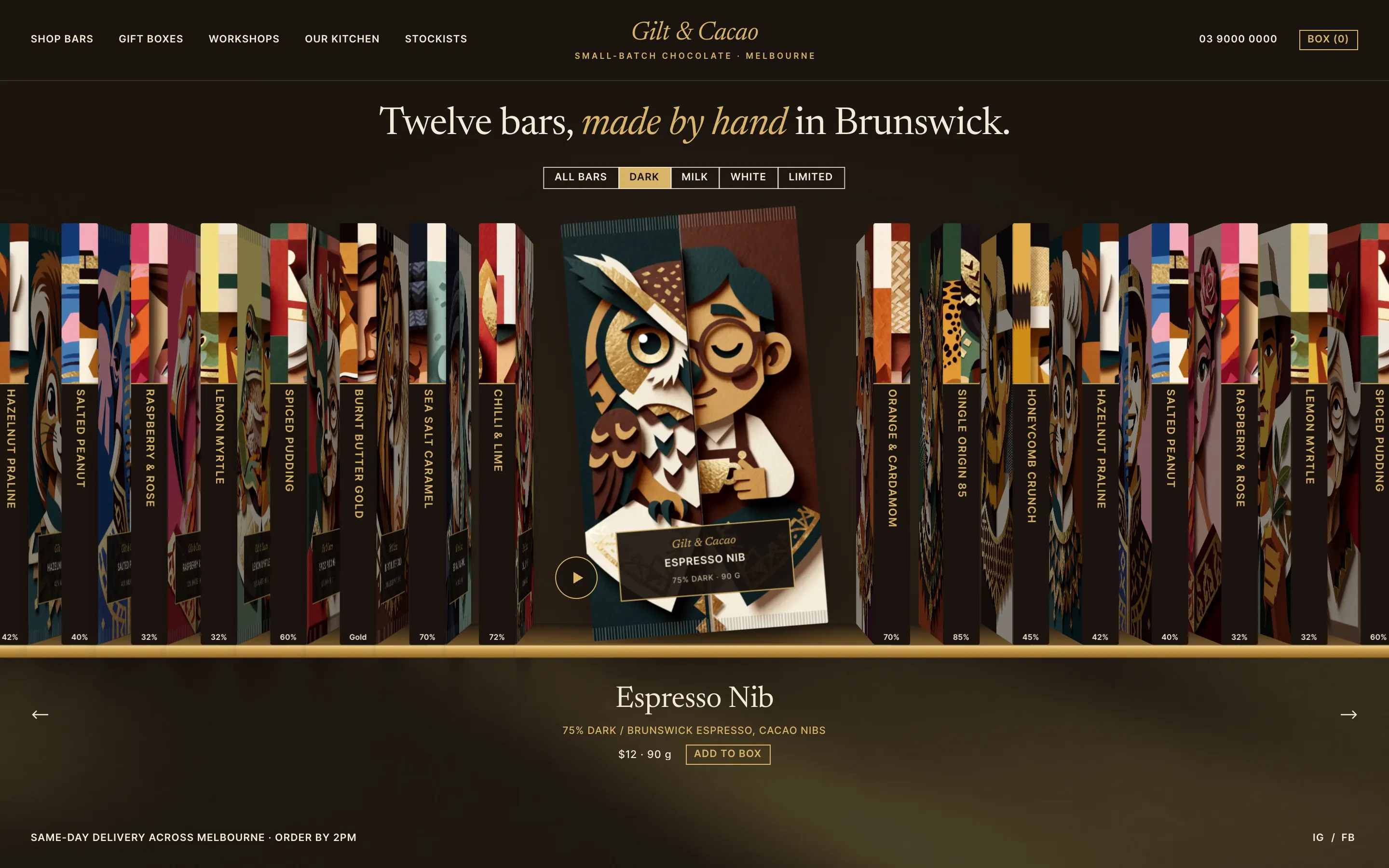
Bar Shelf
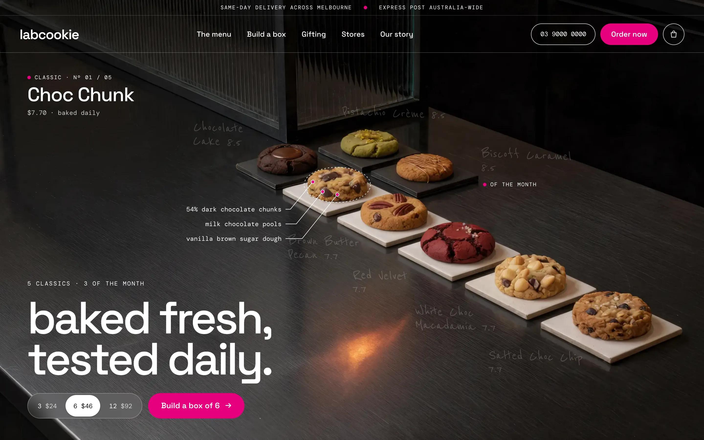
Cookie Counter
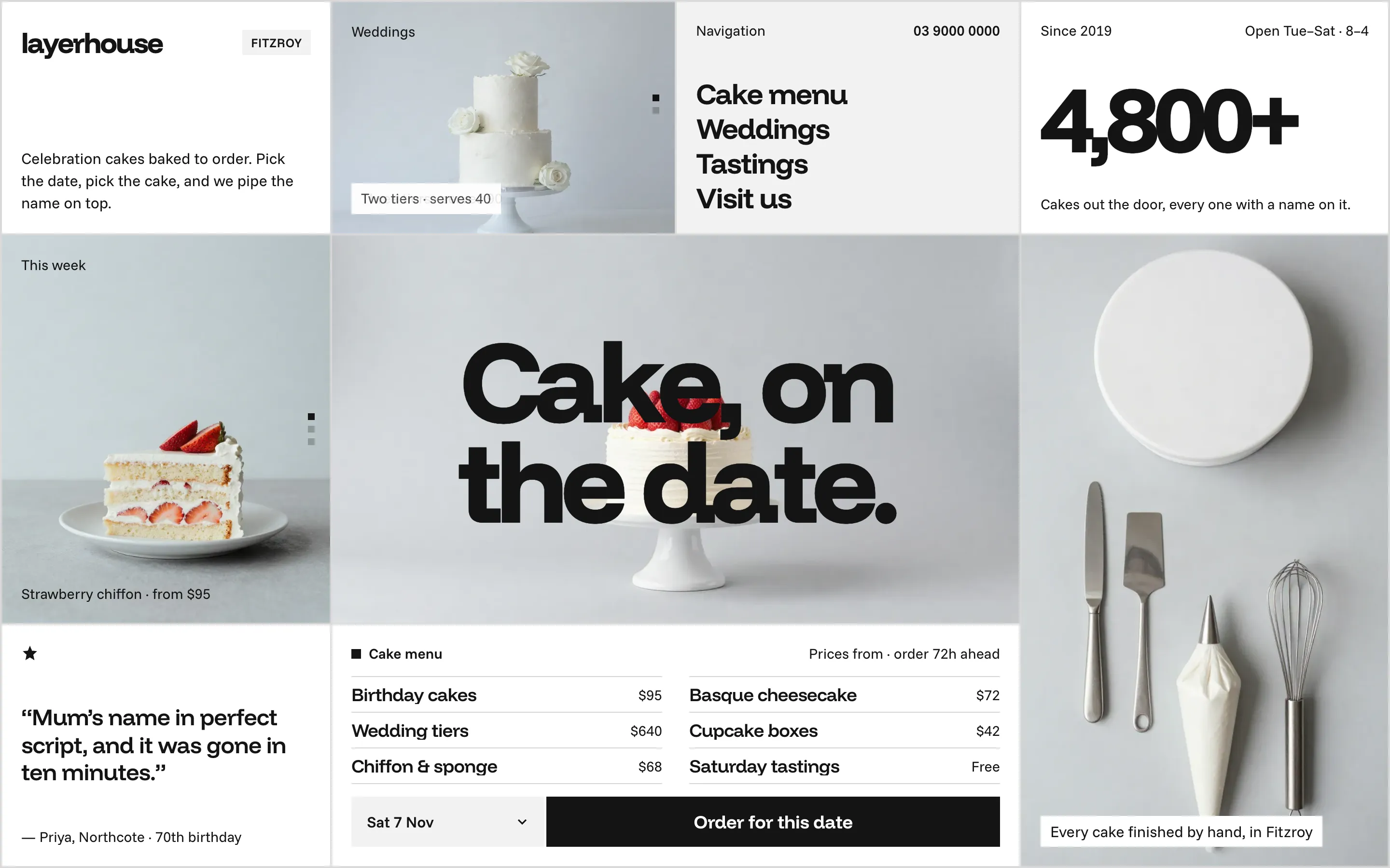
Date Grid
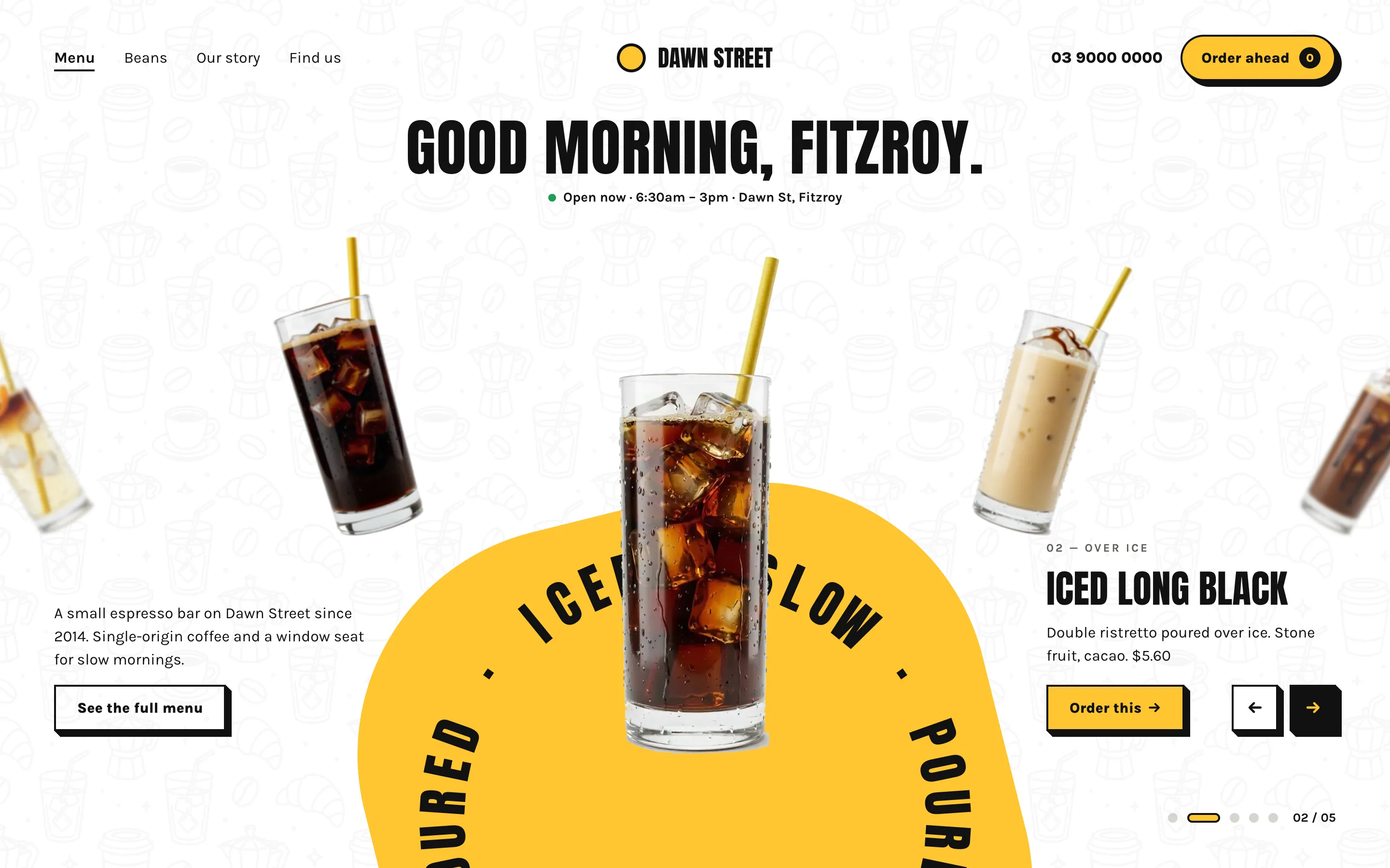
Drink Wheel
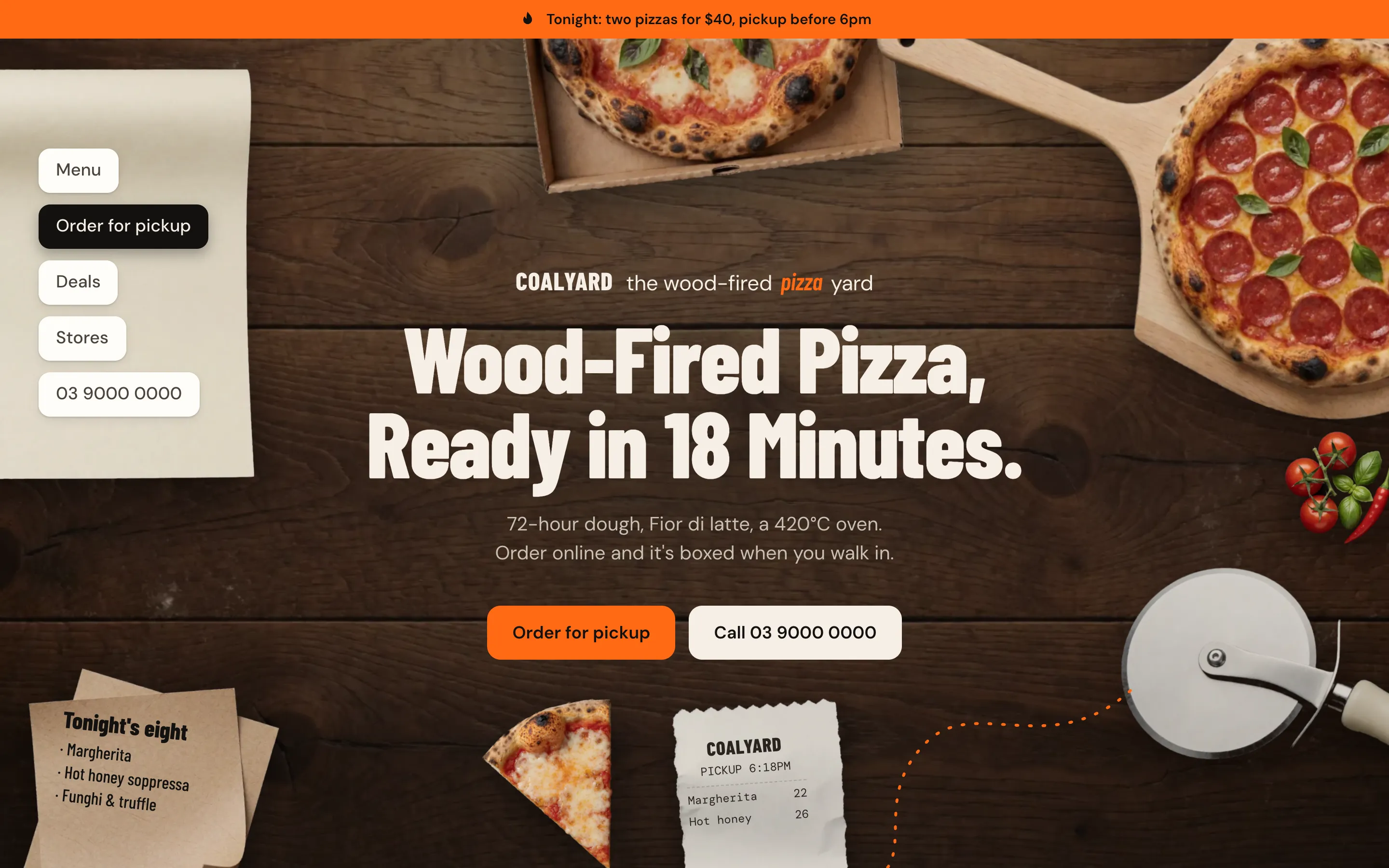
Flat Lay
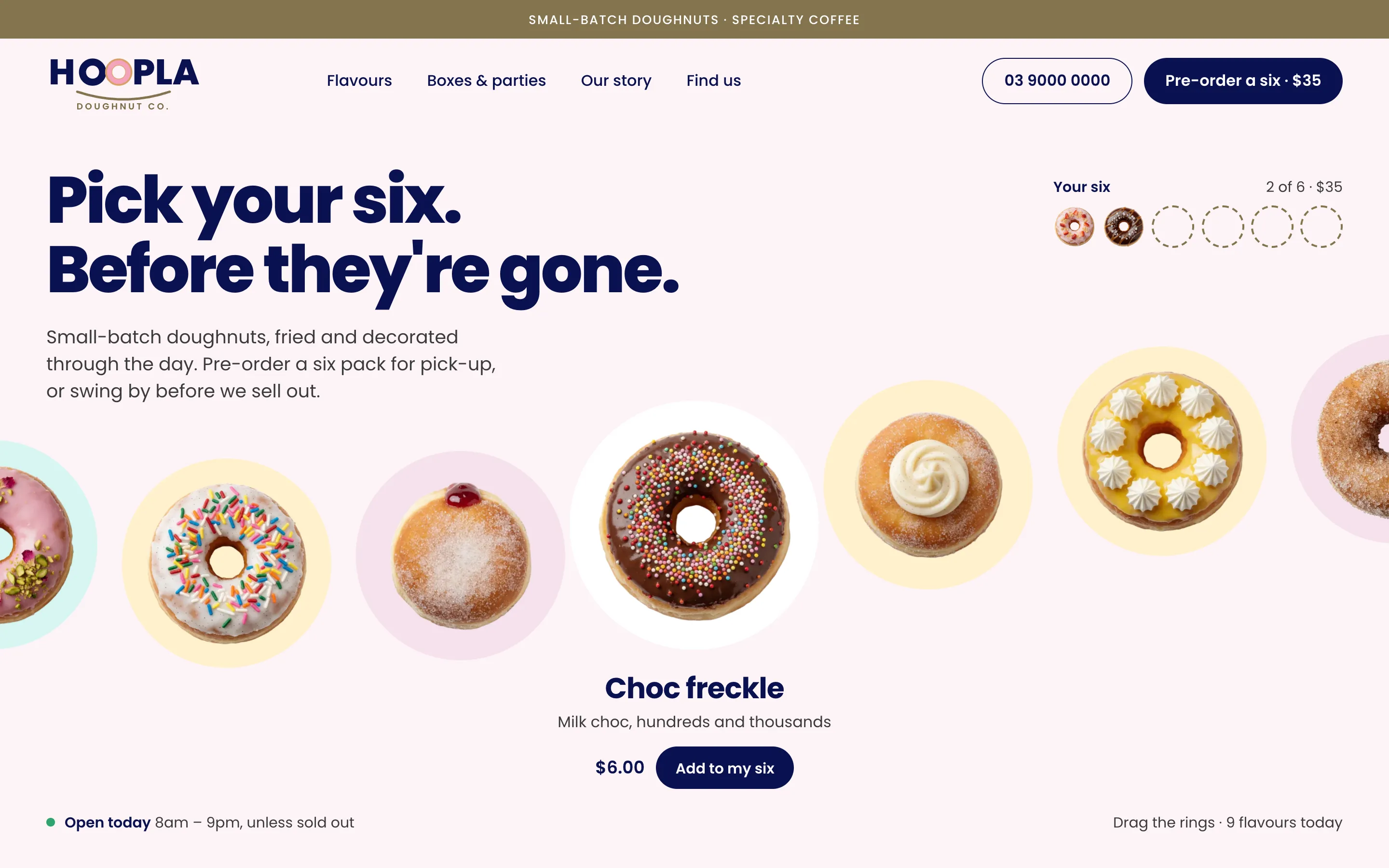
Glaze Wave
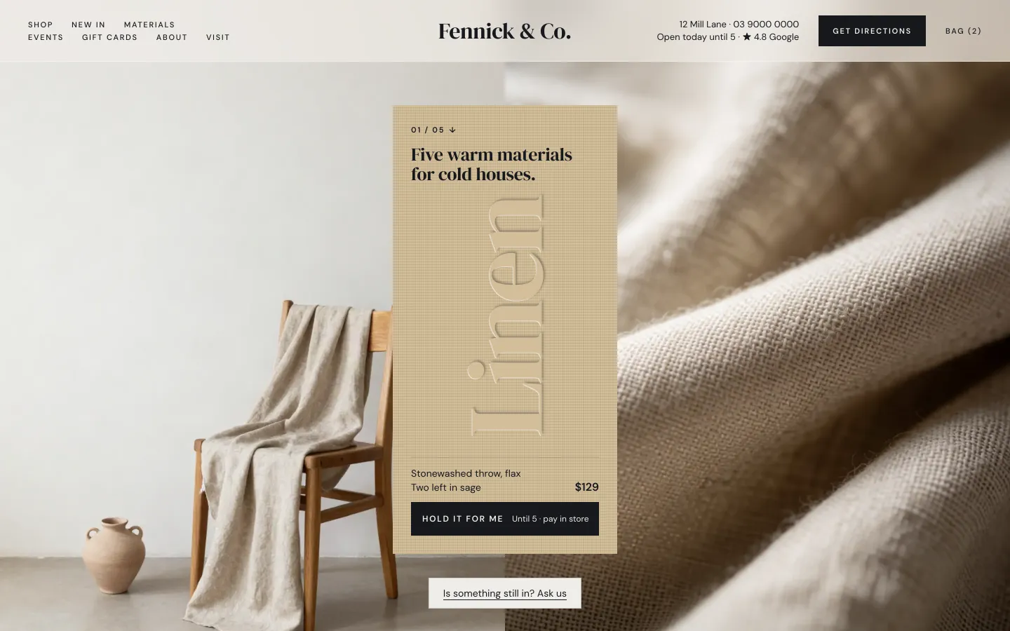
Material Bar
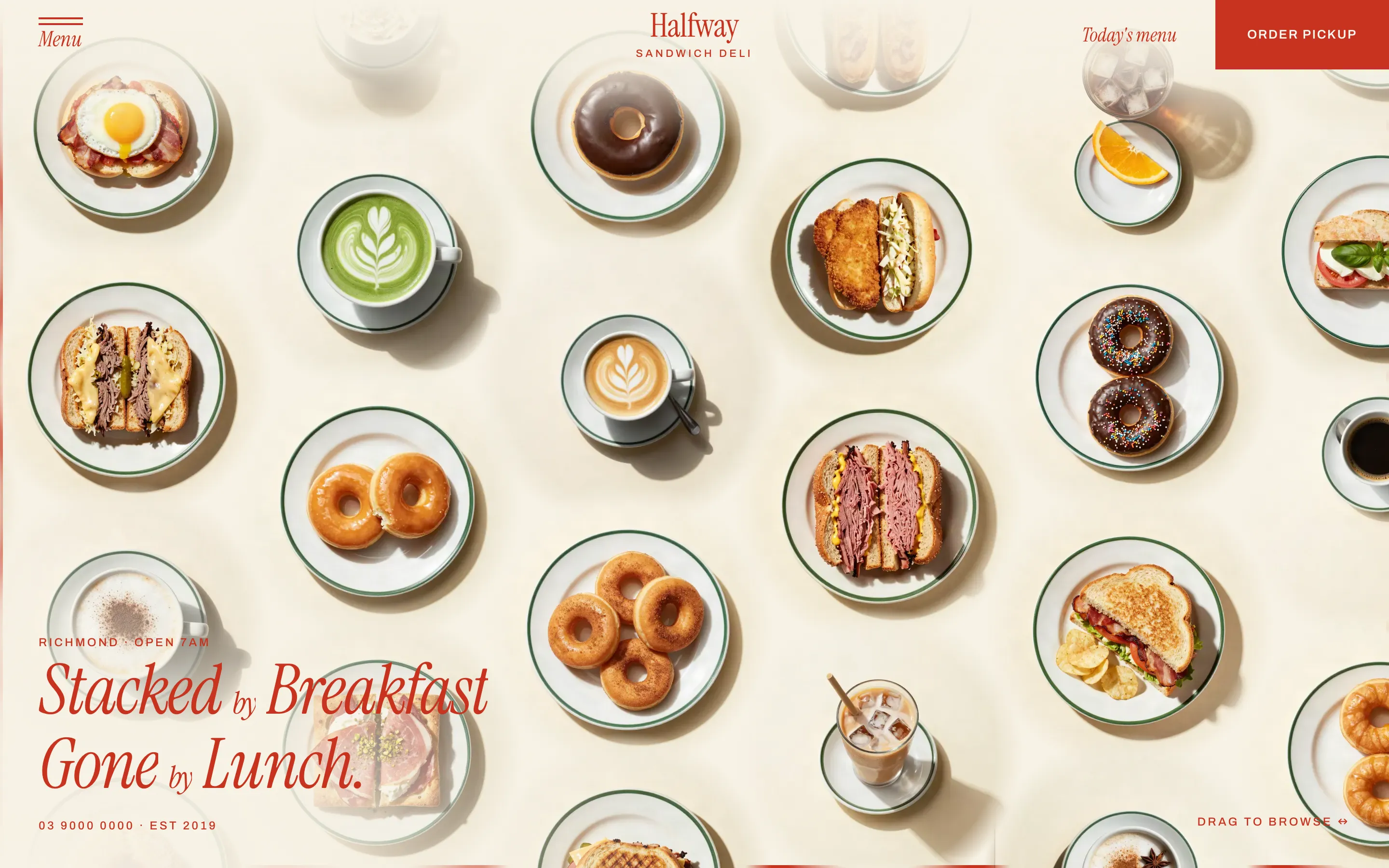
Plate Grid
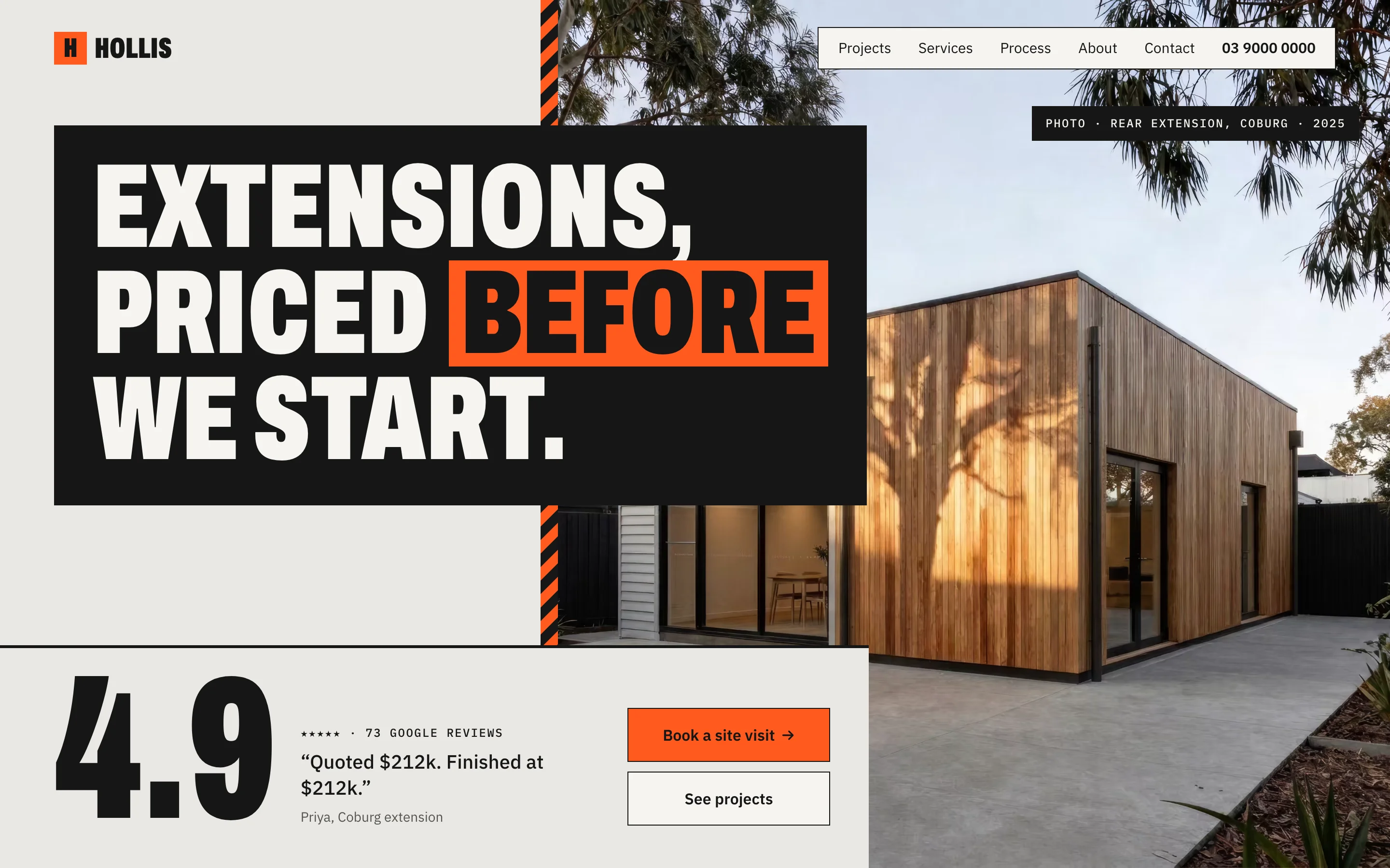
Proof Stack
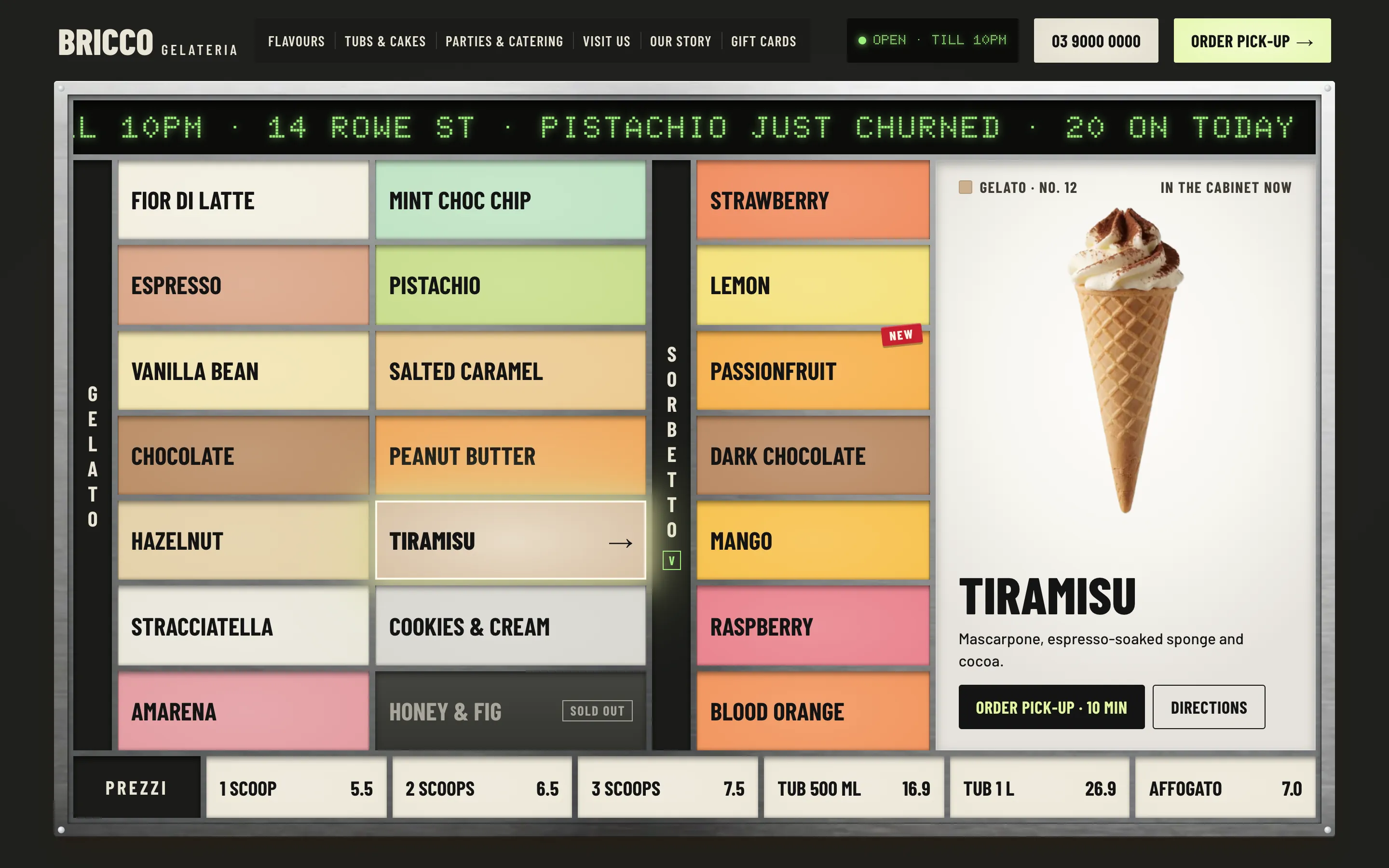
Scoop Board
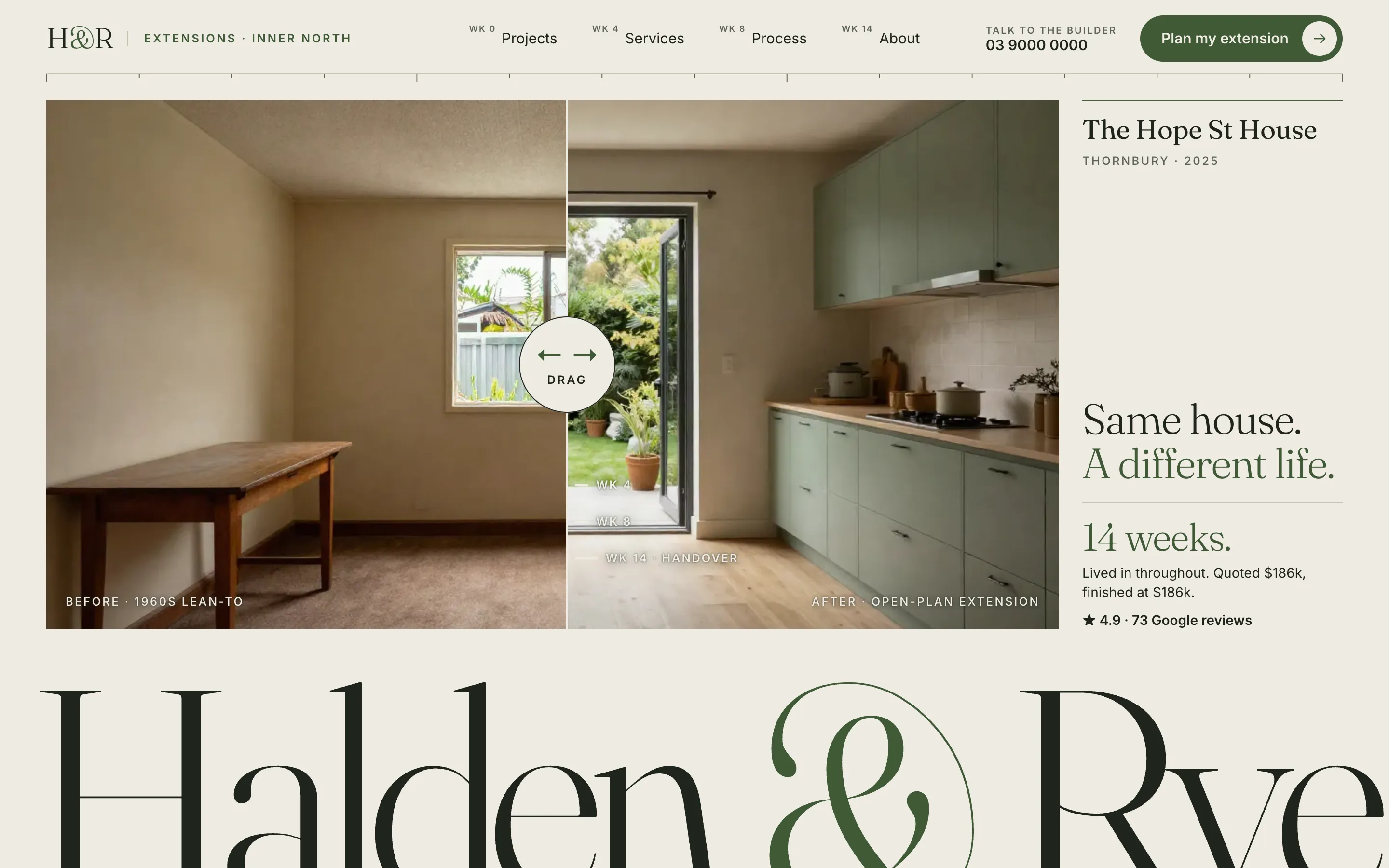
Site Diary
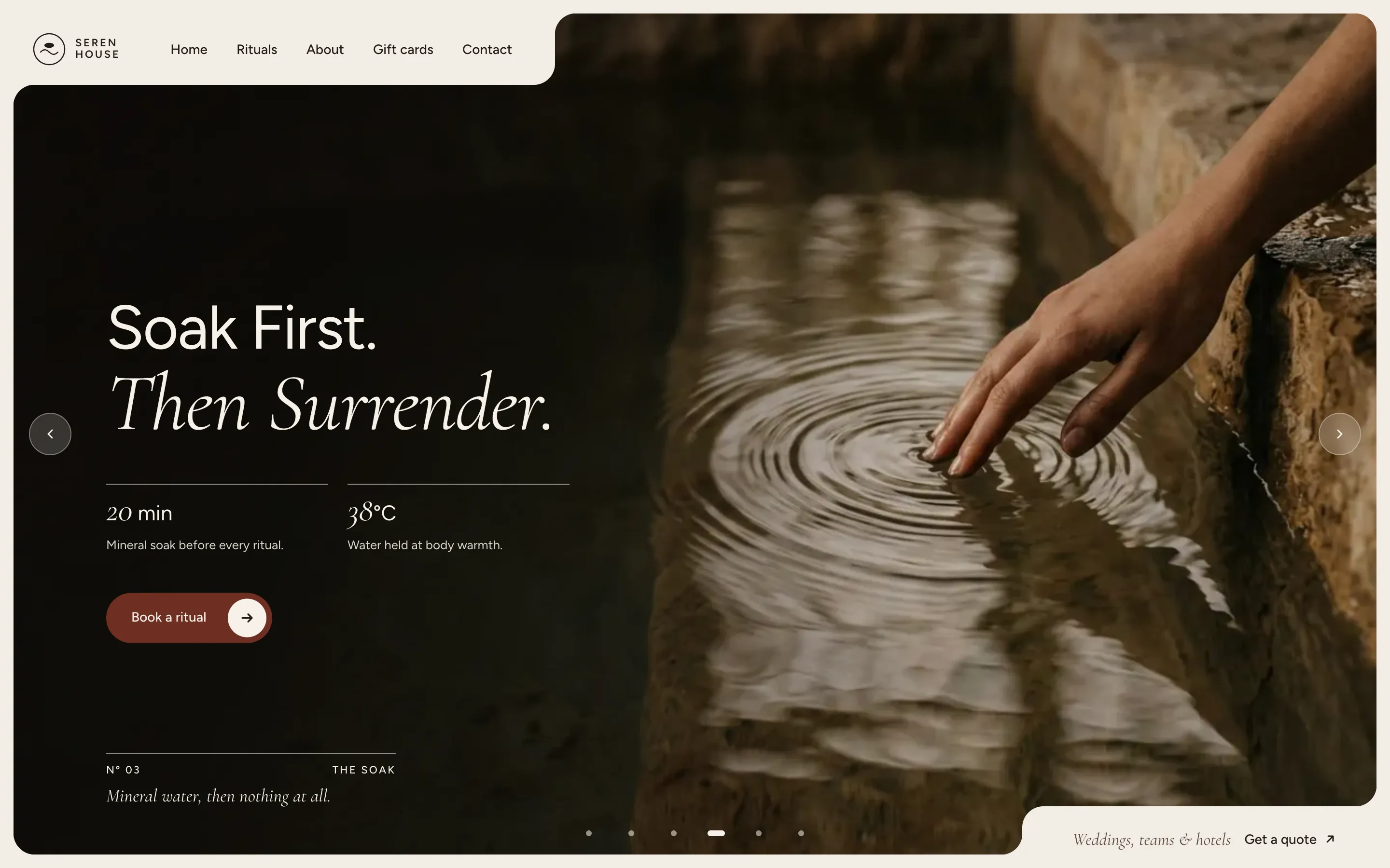
Slow Hands
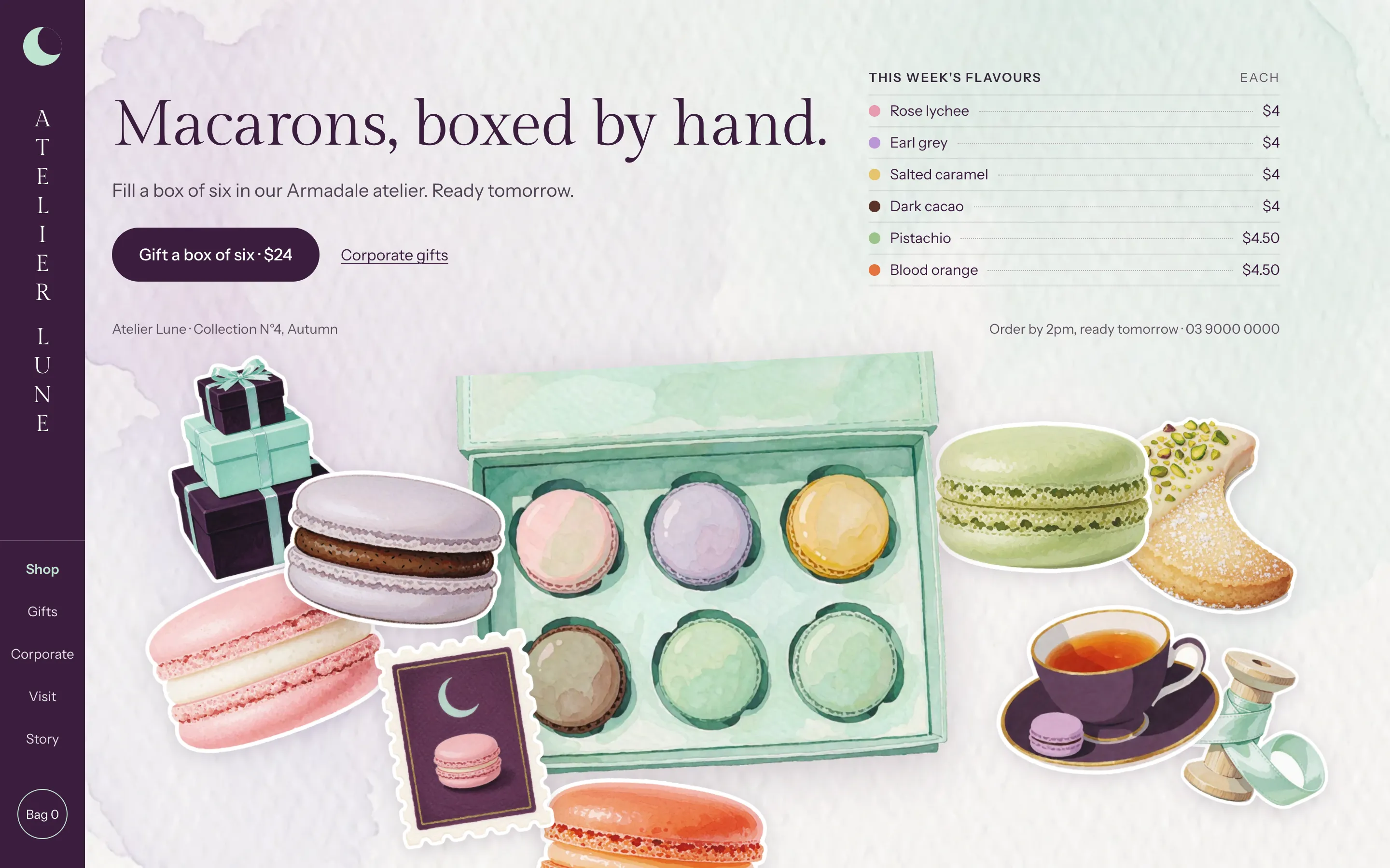
Sticker Box
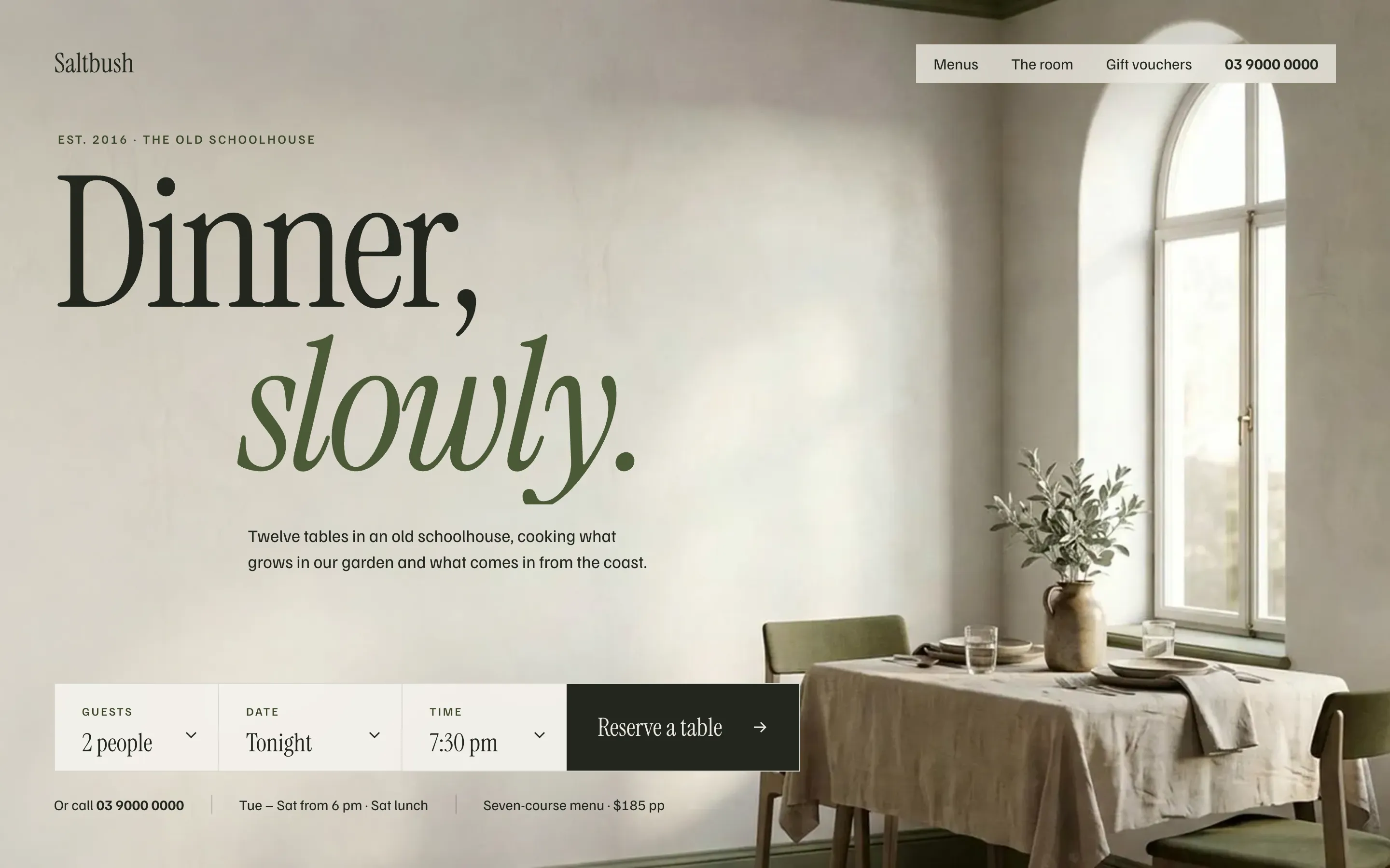
Table Card
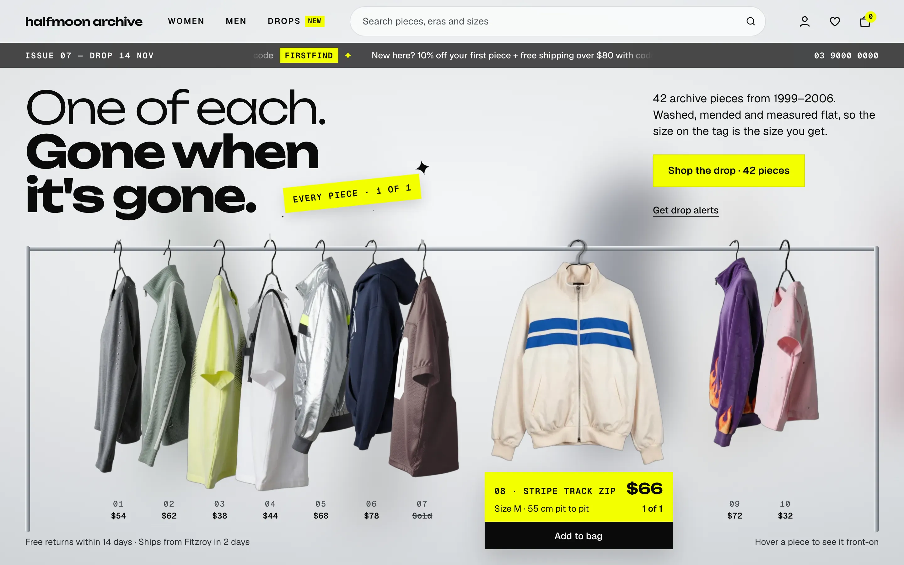
The Rail
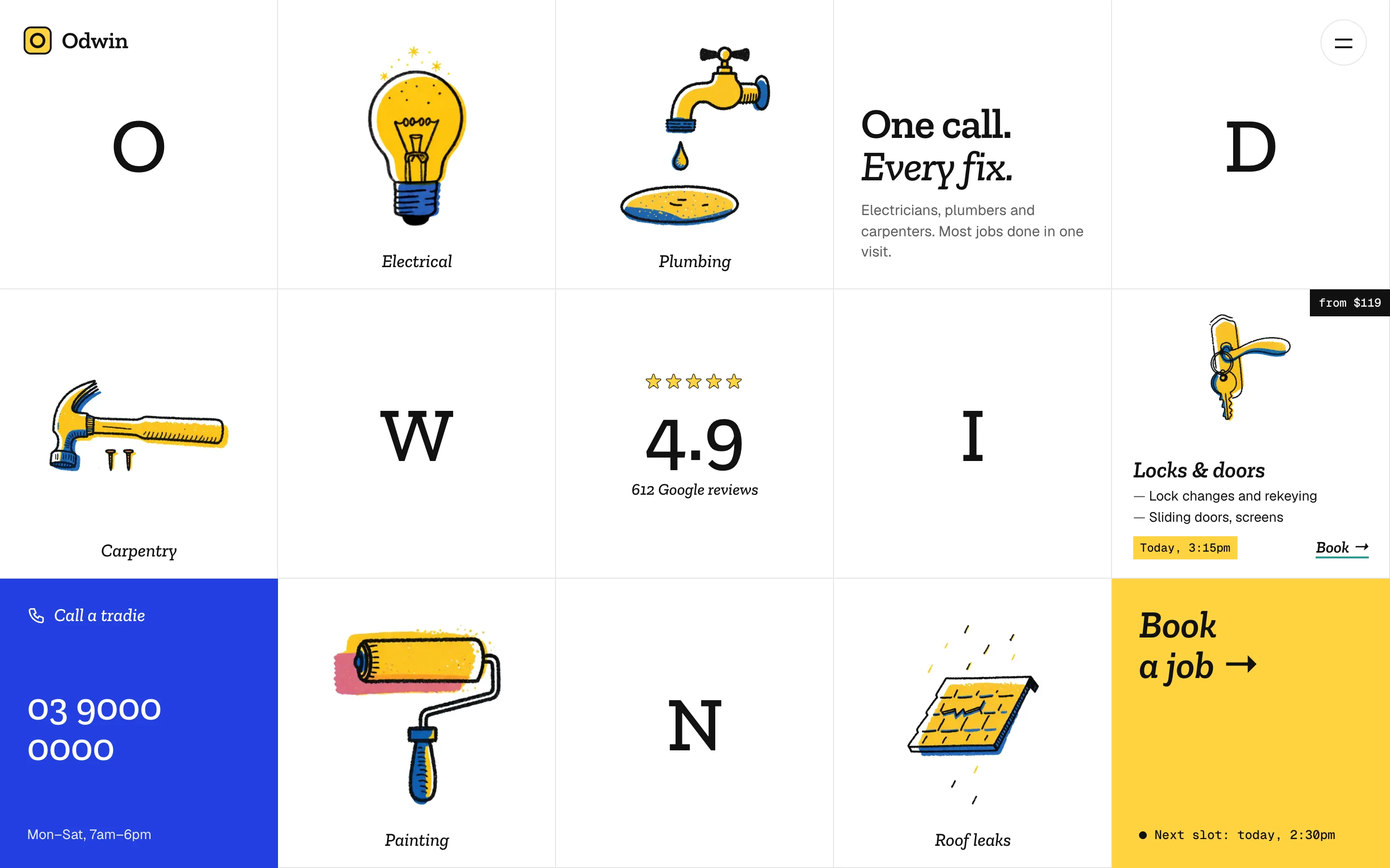
Tile Grid
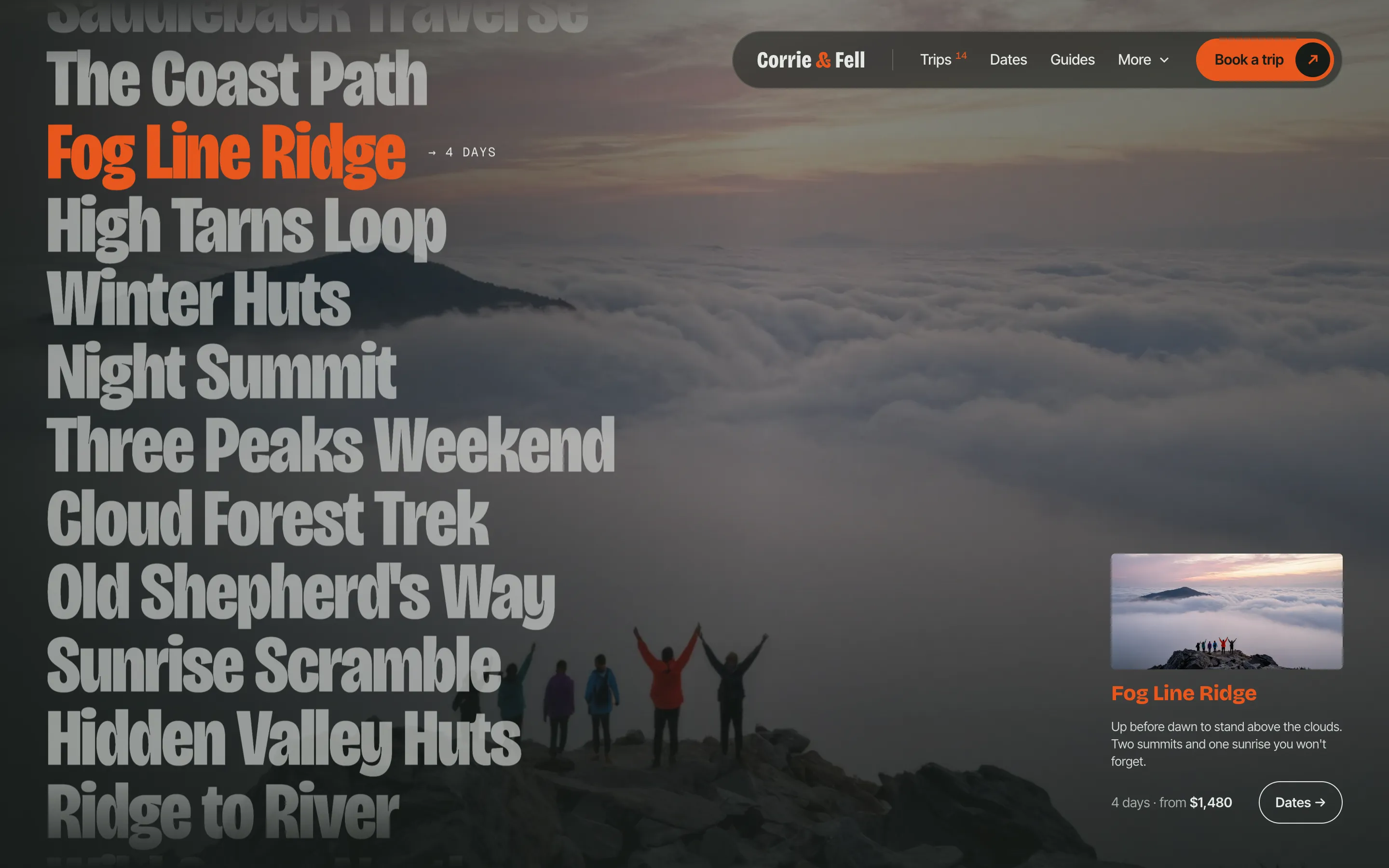
Trip Index